
She shuffled forward.
“I would…”
“Speak up!”
“I would like you to…”
“Yeeeeeesssss?”

“I would like you to typeset this.”
A messy wad of pages; some in different colours, some upside down, some not in any recognisable language.
“You would like me to TYPESET this would you?”

“Yes”
“You have come to the right place.”

—————
I just typeset a book.
It is called George Calderon: Edwardian Genius.
You might have heard of it.
It will be published on 7 September.
Now I will teach you how to typeset a book.
Let’s go.
—————
First of all, what IS typesetting?
The process of self-publishing a book goes something like this:
1. write manuscript
2. make it into a PDF
3. design cover (also PDF)
4. printers print from the PDFs
5. you receive a truck full of copies of your book*
*Note: you now have approximately one fewer room in your house.
Step 2 is what we call “typesetting”, and it is what I did for George Calderon: Edwardian Genius. At its most basic, digital typesetting involves resizing pages to the same format as the final book and then setting the font and paragraphs to look “right” under these new page dimensions. (Some self-publishers seem even to leave out that second part. Pro-tip: don’t, it’s really important.)
When I began, I had only a Word document from Sam1 of the complete text of the book. I began experimenting, shaping this Word document into what would eventually be sent to the printers Clays, and I made a short text file of “steps” that I was performing. I felt that if at any point I had to start again from scratch that would be valuable to reconstruct my work.
I quickly moved on from the steps described in this text file, but here is what it looked like at the last point it was updated:

As you will no doubt realise, some of these instructions are esoteric to how we wanted things to look in George Calderon: Edwardian Genius, and some are necessary actions that you will need to take when typesetting ANY book.
Shortly after writing this text file I decided that step 4 was far too crucial to the appearance of the book (and certainly a key dictator of the eventual number of pages)…far too crucial to be awkwardly done somewhere in the middle of the process.
So I recommend as the very first step in typesetting from a text document…
STEP 1: SET UP THE PAGE SIZE
I used LibreOffice Writer for most of the typesetting, so this is what I’ll be taking my example screenshots from.
Before I continue, I need to stress that it is absolutely imperative that every choice you make is associated with a “style” profile.
If you’re used to writing small documents like 12-page essays for school then the concept of “styles” will seem pointless and alien. In a short document you can just highlight what you like, select how you want it to look, and the computer pretty much “remembers” how you’ve asked for it. Then you print it anyway and you’re done. Sometimes you open the document again and it doesn’t remember how you formatted something and you mutter “stupid computer, glitching out, bunch o’ bugs” but it’s not really because of bugs in the code that the document didn’t “remember” your formatting…it’s because you didn’t use styles.
The Calderon book is about 550 pages so I simply CANNOT risk any formatting being lost, and also I need clean ways to standardise and recycle stock pieces of formatting. So it was fundamental that I be rigorous in using styles.
“OK Kamaji, I get it. I need styles. But what ARE styles?”
Styles are little profiles that you set up using the column on the right in the following screenshot.

They are information cards where you define all sorts of formatting details; then, when you need a part of your document to have those properties, you just highlight that part and apply that style.
Once you get used to using them it becomes quite peculiar to think that for smaller documents the software can “remember” at all how you wanted something to look. Applying formatting using a “style” becomes so intuitive that the notion of formatting anything without one seems as ludicrous as baking a cake without a tin.
I won’t go into too much detail about exactly what to click in LibreOffice Writer to set up styles but you can find lots of guides online about how to use styles in whatever word processing package you are using. Indeed, they work EXACTLY the same in Microsoft Word.
Styles are typically divided into Paragraph, Character, Frame, Page, and List styles. Since we’re starting by setting up the page, we’re going to use a Page style. Mine for the Calderon book looks like this:

The “paper format” is the size of your book. For printing with Clays, their “Royal” size is 153mm x 234mm, so that’s what goes in the width and height fields. Interestingly, it appears “Royal” is different for different printers and it is very important to get the exact numbers here so check with your printers exactly what the dimensions are!
The margins are how much white space there is around the content. We went quite low with these, because it was looking like the book was going to be very long already and we were keen to do anything subtle that we could to keep the page count down.
Your printer will advise you on minimum/recommended margin size but I also strongly urge looking at printed books and measuring their margins to get an idea for what is industry-typical.
If you have images that go all the way to the edge of the page you need to negate your margins on those pages and even run the images outside of the paper size (to create what is called a “bleed”) but I’m not going to talk about that here since we didn’t use it for this book.
The “inner” margin needs to be larger to compensate for the obscuring nature of the middle crease where the book spreads open, and – perhaps more importantly – the fact that some of that part of the page is “eaten” by the binding. In desktop publishing this extra is called the “gutter”.
From studying the materials from Clays, as well as various online resources, I was sure that adding 7mm for the gutter was correct. However, when the book arrived I felt that this was too large and I could have afforded to go closer to the centre of the page. By contrast, the outer margin felt a little near to the edge, so if I could do it all again I would probably reduce the inner margin to 19mm and extend the outer to 16mm. It is worth pointing out too, though, that the apparent asymmetry of horizontal margins in the finished book is not entirely my fault as, upon measuring, it transpires that Clays produced the book with a lessened outer margin than we specified. [Probably because they have a ‘trim tolerance’ of 3mm, which they did not spell out in advance – Ed.]
The “mirrored” page layout is what allows you to set inner and outer margins rather than left and right, so make sure you use it!
At this point I would say experiment experiment experiment. When you typeset a book there is a lot of trying it this way and then that way until you settle on how you like it (which may even be a compromise with increased page count etc.) and the sooner you get used to fiddling with the values, the sooner you will feel familiarity with the process and the confidence to tweak freely.
STEP 1B: SET UP THE HEADERS
In this book we were keen to have “running heads” (the book and chapter titles at the top of alternate pages). To do this you use the “Header” tab.

Even if you don’t want running heads, you likely need to incorporate a header or footer for page numbers so you’ll still be needing these parts of the style menu.
To add page numbers to the header or footer you use “insert -> field -> page number”. You can include a running head here too, and adjust your tabs (at the top of the window) to make sure that everything is in the right place (e.g. page number on outer edge, running head centred). There are plenty of resources online to help you understand how to do such things, for example this article here.
When you insert a page number field, and type text into your header, it typically replicates that for all pages under that style. For this reason I created multiple identical (but differently named) styles so that I could assign a different one to each chapter and thus have a different running head for each chapter. In order to segregate these style regions I used manual page breaks. I am not 100% certain that this is the BEST way to achieve these effects for running heads but it worked perfectly for me.
Remember that you can control page numbers by specifying what page to start on when you do a manual page break. This is particularly useful if you are not doing everything in one file and need a way to “start” on page 46, for example. This came in handy for the Calderon book partly because the prelims (introduction, contents, etc.) were done in a separate document that was then stitched together with the main text at the PDF stage (more about that in the next entry).
Anyyyyyway…at this point you have the book formatted at least with the right paper size and page numbers so it could technically be exported as a PDF and sent to the printers and printed as is…but don’t do that…do this first:
STEP 2: SET UP PARAGRAPH STYLES AND APPLY TYPEFACES/SIZES
In the original document, Sam1 had specified certain properties of spacing for the standard chapter text, for the quotation text, for titles, and for epigraphs, etc.
As soon as you reformat the pages to be “book” sized a lot of that gets messed up. In particular, Sam1 had been meticulous in using a combination of carriage returns, tabs, and spaces to make his text (especially quotations) look “right” as he wrote it. However, that was under the word-processor’s assumption of an A4 page and now we were dealing in Royal. I swiftly got to work defining styles appropriate to the new page size.

Having made styles for every aspect of the main text, I went through all 500ish pages applying these where relevant. Of course, most of that was a stock “Chapter Paragraph” style for the main text, but there was a lot of adding “Quotation Paragraph” to quotations, and also some titling and epigraph style application.
Remember, at this level it’s not that your styles have to be complicated multi-part profiles, but simply that you’re using them at all to make sure your formatting sticks. In the image above, really the only thing we’re defining is a fixed line spacing (for our typeface and font size that 5.5mm is roughly equivalent to 120% or 1.2). You may also have noticed that I have a range of “Chapter Paragraph” styles with different numbers after them. I’ll explain what that’s all about in the next entry (and it’s actually also why I use fixed line spacing instead of proportional).
In unison with applying paragraph styles I also applied character styles in exactly the same way.

It is highly likely I didn’t strictly need to do separate character styles for these font properties and could have used a part of the menu in my paragraph styles. I realised this somewhat deep into the typesetting process though and decided to stick to this technique as it felt “safe” somehow. I think that what I was concerned about was that somehow I might lose the “inherited” formatting from Sam1’s typescript, such as italicised book titles or underlining. My fears may well have been founded though, as there WAS one place where italics were dropped and I DO think it had something to do with paragraph styles imposing an umbrella character style (this is an error that Sam1 mentioned in his previous entry).
Important to do too in this stage is to adjust tab positions as the defaults will likely still be sticking around from when the document was A4 sized, and that means the tabs (indents) could be far deeper than they should be. You do that by moving the crosshairs at the top of the document in the bar that looks like a ruler, or alternatively directly through your style’s properties menu. But make sure that either way you resave the style afterwards!
By this stage the document should be looking pretty much like a proper book and no longer like A-level coursework. If it all appears correct for printing then you can go to:
STEP 3: EXPORT AS A PDF
This was straightforward in LibreOffice Writer, you just click this:

Which gives you this…

And then you click Export and choose a sensible folder on your computer to put it in.
You get a .pdf file of your book wherever you chose, you can check it over and – assuming all looks good – you’re safe to send it to the printers!
However…as you might have guessed, in the case of the Calderon book there were many, many quirks and complications that vastly overshot the boundaries of this bare-bones typesetting guide.
For now, I hope you have enjoyed seeing a little behind the curtain on how to get a text document into a publisher-ready PDF, but in the next entry I will tackle the really interesting stuff: those challenges unique to typesetting George Calderon: Edwardian Genius, and how we overcame them.


")


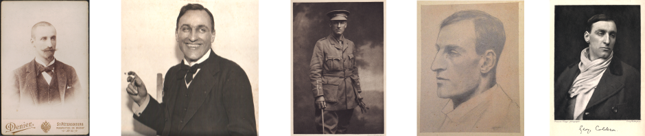
; George Calderon's pencil sketch 'Manu' (right)")


Guest post: Sam2 on… ‘How to Typeset a Book’ (Part 2)
“Pages… Pages EVERYWHERE!”
—————
In the previous entry I went over some fundamentals of self typesetting. I want to point out that those techniques were merely what I had used myself…that is, how it appeared logical to me to do it.
The methods were effective and I believe form a solid guideline to someone else wanting to do the same, but there are definitely other ways to achieve a great end result, perhaps slightly differently from how I did it and certainly by using alternative – possibly better-suited – software.
In this sense, my experience typesetting George Calderon: Edwardian Genius was one of repeated problem solving: constantly experimenting with and deciding on ways to get around some issue or another and – crucially – doing that within the restrictions of the software I had already begun using.
In this follow-up entry I talk about several finer points of that problem-solving process.
Let’s go!
—————
Problem 1: Inset Images
At some stage in the reading of Clays’ guidelines we realised it was a possibility to have images within the text. Up until then it had been assumed they would be in a separate “glossy” section all together in the middle of the book. As soon as this option was introduced, I got to work inserting pictures into the LibreOffice document to see how they would look.
Before I had even begun typesetting the book, Sam1 and I had assembled a folder of all the “figures” that would be used, copying and editing digital files, and scanning those we didn’t already have. As a result, it was easy to take pictures from that folder and put them in the text with a simple drop-down menu.
Once an image has been inserted, it is straightforward to resize until it is the way you want and then write a short caption below. (Of course, DO create and apply an appropriate style for these captions so that they are consistent.)
Complicating the above process somewhat was that several images needed to be in landscape on a full page and thus the caption would also need to be in landscape. To achieve that, I added the caption in an image-editing program (GIMP) then inserted that pre-captioned image in the right place. Unfortunately this led to some inconsistency in the text style for such captions, because the font “point size” is relative to the resolution of the image and, once inserted and resized, will no longer be consistent with the exact value originally chosen. Fortunately I don’t think it is too noticeable and is justified by not wanting the caption to eat too much of the page space for these “full page” images.
Getting the images into the text is the easy part. It is after they are there that the fun begins (for a given value of “fun”).
The first issue is that it is all well and good for the inset images to look nice on the screen but how will they come out in the paper book itself?
This is why we sent a 16-page PDF to Clays for them to print out and send back to us. You may remember Sam1’s posts about this.
The short version of what happened is that we received these proofs back from Clays and the images looked too “light”. Although I had followed their guidelines meticulously (the printers recommended making images lighter because they would come out darker in paper than they looked on screen), the printed images were definitely too light. I vociferously argued to Sam1 that we needed to fix this “so that black really is BLACK and not just f***ing DARK GREY!”
After being shown direct comparison with a published book that also used inset images, he saw what I was being so passionate about and he completely agreed it should be corrected.
I went through the images again, tweaking brightness and contrast to be darker and richer, before we sent off another 16-page PDF to see again how they would look on paper.
To tweak the brightness and contrast I used a free graphics program called “GIMP”.
The second test print looked great and – in combination with invaluable feedback from Calderonia readers – we were happy that using inset images over a glossy section was the correct decision.
Something that was incredibly frustrating at this stage was that in certain places I would find carefully-positioned images + captions saving inconsistently. That is, I would have an image and caption exactly laid out so as to be as unintrusive as possible (and – very importantly – not generate awkward single line “widows” or “orphans” in the text) but, upon reopening the document, that layout would be one line “out” from how I had set it.
I wrote in the previous entry about how this kind of inconsistency is EXACTLY what happens when you do not implement styles properly, but I had rather recklessly assumed that styles only applied to text and not images, so my solution to this problem was to leave these parts of the book as they were and make sure that when I generated the PDF those sections were spontaneously adjusted to be outputted correctly. In future I might attempt to get more to the bottom of WHY such inconsistencies were creeping in, and seek to solve them with a style solution, but this time I did not and – fortunately – it was all OK.
There was another serious issue thrown up by inset images, but it overlaps with the PDF fine-tuning that I talk about later in this article so I have saved it for that section.
Problem 2: Hair leads and vertical justification
The typeface Dante MT was chosen after much careful consideration and, now the book has been printed, we have had some incredibly positive feedback about it. However, it did throw up a few problems in the typesetting because it turns out that certain character combinations render too closely together, especially where italics are involved.
This led to our manual “fixing” of such problems by inserting arbitrary small spaces between letters.
The characters at the end render too closely without manual insertion of a space.
A “fixed” version with a space inserted in between.
Naturally, a normal-sized space would be too much so we used appropriately-chosen “thin” or “hair” spaces from here.
The process was time-consuming and we kept finding ones we had missed, but it was very satisfying to fix the text in this way. I believe there may be a few places in the final book that still slipped under the radar, but I can’t even remember where they are so overall I’m very happy. [Sam1 has a record of them for the second edition – Ed.]
The other spacing issue (I suspect likewise caused by Dante MT) was that text would sometimes finish on different levels at the bottom of pages. Certainly a part of this is that the font size for quotations is different from the font size for the normal text so any page is necessarily made from a mixture of lines having different heights. However, I believe there is more to it than just that as we found the same problem even on spreads with no quotations. I don’t know exactly why this happens but my suspicion is that it varies depending on the nature of the letters used in that line (e.g. a “t” uses more of the vertical space than an “a”).
Worth noting is that you see this issue in many professionally published books nowadays. That is, there are places where the text on two pages of a spread literally finishes at a different vertical position.
However, Sam1 was very keen to make sure that his book be fixed to not commit this error, so fix it we did!
You may remember from the previous entry that I showed a screenshot where many paragraph styles were listed.
Our method of solving the vertical alignment issue was to use these styles to adjust the vertical spacing of individual paragraphs until the bottoms of the pages were lined up. This took a lot of judgement and really felt like the closest thing to hand typesetting on the entire project.
Fortunately it wasn’t every spread of pages to which we had to do this – maybe only every 20 or 30 pages – so it didn’t take too long, and it was (as with the hair leads) a very satisfying process.
Sam1 and I agree that were we to do this again not only would we adjust the spacing to make the bottom line level on facing pages in a spread (as we did) but we would also make that level consistent across the entire book. Occasionally you can just about perceive (in places where the text shows through slightly on a page) that the “finish line” of one spread is a different height to the “finish line” on the following double spread. The main reason we couldn’t fix that for the version that went to print is that by that point Sam1 had had to complete the index in order to meet the submission deadline, and to fine-tune to that level of precision would have meant certain lines jumped over or retreated back across pages: a catastrophe for index consistency.
Overall I was extremely pleased with our ability to hand-fix these spacing issues as it really felt like something from the Gutenberg era and proved to me that there was value in typesetting so closely with the author to get it exactly how he wanted it. I suspect that if I use a more powerful piece of software in future (perhaps Adobe InDesign, which I have experience with from my newspaper days) then there will be lots of software solutions to such problems, but it feels fantastic to have done it manually at least once.
Problem 3: Crop marks, trim marks, and corrupted PDFs
I picked up very early on from Clays’ guidelines that I would need to have marks on the submitted PDF to indicate the edges of the page. These “crop marks” and “trim marks” are something I assumed I could add in LibreOffice but it turned out I couldn’t!
The crop and trim marks are the “crosshairs” in the corners. I deliberately didn’t give this a border (as I usually do for page images on this blog) so that you can see how necessary they are to defining where the page actually is if is placed on a background of the same colour.
After extensive research into what free programs I could use to add such marks, I ended up downloading a trial of Adobe Acrobat Pro and using that. The software is amazing, and I realised that not only would it do what I needed for these page marks but the rigour and stability with which it authors PDFs would assuage some of my concerns that a purely LibreOffice outputted PDF might contain bugs that could have disastrous consequences on our final book when Clays printed it.
As a result, we ended up paying for a subscription to Adobe Acrobat Pro for three months during typesetting and I consider that to have been money very well spent.
Adding the necessary page marks was easy, but something else that the software was extremely useful for was “patching together” the book from separate PDFs. I had already typeset the “preliminaries” separately from the rest of the book and could use Acrobat Pro to combine them into one PDF, but it also helped overcome an issue that LibreOffice was throwing out when I tried to export the main book as a PDF.
The issue was that – in certain places where there were inset pictures – the PDF would be corrupted and the pages would be in the wrong order or there would be repeated images where there should be a different one.
Throughout the project I had been the most ardent apologist for the software we used and defended virtually every perceived “bug” or “glitch” as having a deep-seated reason that I, as a naive typesetter, had simply not fully understood but could overcome through self-education.
This is actually a good stance to take because it removes the option of lazily blaming something on a bug rather than taking personal responsibility, and did encourage me to learn the reasons for everything (or at least try to). 99% of the time it was that I could discover the right way to do it and get through whatever issue we faced.
However, in the case of the corrupted PDFs I felt the software was the one letting me down, and this was unbelievably tilting.
I took a deep breath and resigned myself to this being a problem that would need to be solved through ingenuity rather than documentation.
By outputting the file in stages with particular care on the pages with problem images (which I would export as single page PDFs) I could then construct the entire book in Acrobat Pro by importing the sections of pages separately in order.
It sounds as annoying and time-consuming as it indeed was, but at least I had a workaround for this bizarre LibreOffice bug and could get the entire book together as one consistent and flawless PDF which was then sent to the publishers and…
…well…
…I think you know what happened after that.
—————
I have covered three main areas of the finer problem solving associated with typesetting George Calderon: Edwardian Genius. Needless to say, there were countless other issues that required tweaks and fixes to get up to standard and many of these I simply fixed and have forgotten! I hope this duo of posts has been interesting to Calderonia readers and if any require help on their own projects do feel free to get in touch.