‘Bugles calling for them…’

Wilfred Owen Grave

It is a source of sorrow to me that for unforeseeable reasons I have not been able to honour my acceptance two years ago of an extremely kind invitation from the Wilfred Owen Association (France) to attend the commemoration today at Ors (located on the Sambre–Oise Canal) of the poet’s death in action on 4 November 1918. A search of Calderonia on Owen’s name will show what a presence he has been here over the past four years.

As followers will know, I deplore those British historians who believe that our war poetry (which means above all Owen’s) has somehow replaced rigorous historical teaching of World War I in our schools and that we need to ‘come out of Poets Corner’ to see the War in a proper perspective. I know from my own experience that war poetry is often presented simplistically at school, but that does not mean ‘the First World War is taught more as tragic poetry than as history’ (Adrian Gregory). Our war poetry has too often been taught as mere ‘protest poetry’, i.e. verse that protests war is wrong, we were wrong to fight this War, soldiers shouldn’t have been fighting it, they were victims.

If this were all that Sassoon’s, Owen’s or Gurney’s war poetry was, then it would not be poetry. But it is poetry, because it is verbally and morally complex, subtle, ambivalent, multivalent, polyphonic, alive. I’ve written before about how poems of Owen’s have been misunderstood as a result of simplistic reading, e.g. ‘Dulce et Decorum’.

One of the prime reasons that Owen is a great poet is that even as you read a line of his it reveals a range of possible meanings to you and a complexity of thought; it writhes in your brain, as it were, so the poem literally appears to live… Examples that I particularly admire are the last line of ‘Greater Love’ — ‘Weep, you may weep, for you may touch them not’ — and the line ‘bugles calling for them from sad shires’ in the sonnet ‘Anthem for Doomed Youth’. ‘You may weep’ is ambiguous enough, but ‘touch them not’ is searingly so: you cannot touch them literally, physically, because they are dead, but you cannot touch them (their greater love) metaphorically either, in the sense of attain to or equal them (it). Similarly, ‘bugles calling for them’ could mean just ‘in commemoration of them’, or, unbearably, it could mean ‘calling them home but they cannot come’.

Owen cannot come back to the ‘sad shires’ who mourn their dead of the Great War. After hardly any of his poems were published in his lifetime, it was his words that answered the bugles’ calls to return to the land that ‘bore’ and ‘shaped’ them (Rupert Brooke), and it is unthinkable that they will ever be devalued as long as the English language exists.

A review by DAMIAN GRANT appears here.

A review by JOHN DEWEY appears here on Amazon UK.

Comment Image

Posted in Edwardian character, Edwardian English, Edwardian literature, Heroism and Adventure, Modern parallels, Personal commentary | Tagged , , , , , , , , , , , , , , , , , , , , , | 2 Comments

Who are ‘war heroes’?


Heroic Medley

Subscribers to Calderonia are probably unaware that the wording of the sales post below, which has been up since publication day on 7 September, has actually changed several times as we were obliged to re-target our marketing by theme and readership (see the first sentence of my previous post). With Armistice Day approaching, the question arises as to whether we should now shift to George’s participation in the War. Should the book be temporarily rebranded as the first biography of a ‘Gallipoli war hero’?

This begs the question of what, in 2018, a ‘war hero’ is. A growing number of people may believe that there can be no such thing as a ‘war hero’; that the term suggests glorification of war; that there are only victims, on both sides of a war.

I think the nuances of ‘war hero’ are complicated. The very word ‘hero’ implies, somehow, a person too superhuman to be human, a kind of one-dimensional being. Calderon and St John Hankin mocked the Edwardian hero-man in their play Thompson.  I remember once when I was interpreting for theatre director Toby Robertson at the Moscow Arts during a tour to Russia by his Prospect Theatre Company, he said to his Russian counterparts: ‘We like our heroes with flaws, but I get the impression you like…your heroes.’ Soviet statues of their heroes certainly tended to be strongly featured, monolithic and intimidating.

If we recall the heroes of the Trojan War, do we think of them as superhuman mainly for their ability to kill the enemy and survive horrendous wounds? Richard Westmancott’s 1832 statue of Achilles in the Wellington Memorial at Hyde Park (above left) seems to portray him as a killing machine, and I suspect for a long time in Western culture that is what a ‘war hero’ (for instance of the Crusades) was.

Yet what seems to have fascinated the Greeks themselves about Achilles was his beauty, his friendship with Patroclus, his brilliance as a military leader, his emotional vulnerability, his feminine side, and the fact that despite having been endowed with magical invincibility he still had, well, an Achilles Heel. Many classical statues of Achilles focus on that, depicting him lying on the ground, wounded, dying, with the arrow in his tendon. He was a hero with a flaw, and since it killed him, it was a tragic flaw. There seems to be an area where the war hero and the tragic hero may merge.

In the above portrait of Nelson, by Lemuel Francis Abbot 1800, we know immediately that Nelson is a ‘hero’ because he has a stiff, monument-like torso draped with the insignia of naval achievement. Yet his face, although wearing a determined expression, looks rather soft and sensitive. He was never personally a killer like the Greek heroes, though he was a brilliant strategist of killers. As a commander, he won the crucial Battle of Trafalgar, which made him a super-hero, but he was killed winning it. Indeed, at school in 1957 our teacher, who had lost both of his legs in the First World War, told us that Nelson was shot by a sharpshooter because he insisted on going out on deck in all his regalia, which made him conspicuous. Nelson, the teacher insinuated, had a fatal flaw (‘hamartia’ in Aristotle’s theory of tragedy) and he died through hubris…

Few people, surely, would deny that Winston Churchill is a war hero, yet he never personally killed anyone, as far as I know, even when he was a professional soldier in WW1; and although he had his warts, I don’t think he had a fatal flaw. Nor was he killed in the course of leading the war effort, although he did not spare himself in that effort. What the ‘iconic’ 1941 portrait of Churchill by Karsh conveys is genial resolution, defiance, determination to win the war. Which — vital, of course, to being a war hero — he did.

Whether a war hero is a successful killer, a successful commander, has a fatal flaw, or is ‘tragically’ killed in the course of the fight, it seems that there has to be in him/her a readiness to give their all, possibly but not necessarily making the ultimate sacrifice. In this sense, Edith Cavell is undoubtedly a war hero, despite what she said about patriotism being ‘not enough’. Selfless courage, to the point of self-sacrifice,  seems to be the defining feature. So, for his determination physically to defend his country from occupation and for his self-sacrifice on 4 June 1915, George Calderon certainly deserves to be called a war hero. (He could also be said to have had a tragic flaw: unflinching impetuosity.)

As we know, the vast majority of those who came back from WW1 were not thought of as war heroes. But in my view they are that because they either willingly or unwillingly exposed themselves to the ultimate sacrifice in a just cause for the rest of us. More commonly, since the 1960s at least, the ‘average Tommy’ has been regarded as a victim of war — although Peter Jackson, in his Q&A after the premiere of They Shall Not Grow Old, specifically commented that the testimonies and footage he had used disprove that.

And what of the civilian casualties of WW1? Were they just collateral ‘victims’ of war, or do they too deserve to be called ‘heroes’ because they gave their lives in the greater cause of our freedom? Or were all the ‘war heroes’ on both sides essentially ‘victims’ of war? But does ‘essentially’ just mean ‘from a certain point of view’,  i.e. subjectively, and if so, what is that worth? How can someone who willingly sacrifices their life for their country be called a ‘victim’? Isn’t that patronising? Wouldn’t they be mortally offended?

I leave these questions with you…

A review by DAMIAN GRANT appears here.

A review by JOHN DEWEY appears here on Amazon UK.

Comment Image

Posted in Edwardian character, Edwardian English, Edwardian literature, Heroism and Adventure, Modern parallels, Personal commentary | Tagged , , , , , , , , , , , , , , , , , , , , , , , , , , , , , , , , | Leave a comment

Thank you, Blackwell’s of Oxford!

Chekhov and Calderon display at Blackwells

The promotional stand at Blackwell’s earlier in the month

One day, perhaps, I will describe how my whole post-7 September marketing strategy was upset and I had to re-focus immediately on my potential Russianist readership worldwide… Thank you to ALL Russianists everywhere who have responded magnificently! I know there are many more of you out there and I am confident that you too will answer the call of Edwardian Pioneer Russianist George Calderon, the Man Who Brought Chekhov to Britain, in due course.

Meanwhile, everlasting gratitude to Blackwell’s of Oxford, who enthusiastically took up my invitation to mount a promotional display of my book and current translations of Chekhov and other classics of Russian literature (see above). There is appropriateness here, of course, as I calculate that Blackwell’s must be situated about 200 yards from George’s old rooms in Trinity College and Oxford University has a first-class Russian Department with, I’m sure, scores of keen freshers streaming in this term.

I understand now why Blackwell’s are consistently Bookseller of the Year, and I wish Heffers of Cambridge and Toppings of St Andrews would follow their example!

SOME RESPONSES RECEIVED SO FAR

The book is written with great assurance and the reader always feels in safe hands. I liked the idea of it being a story and I read it the same way I would read a novel.’ Harvey Pitcher, writer

It is a masterly synthesis of your own approach with scholarship and very judicious discussion of the evidence.’ Emeritus Professor Catherine Andreyev, historian

‘A monumental scholarly masterpiece that gives real insight into how the Edwardians viewed the world.’ Arch Tait, Translator of Natalya Rzhevskaya’s Memoirs of a Wartime Interpreter

You have, I believe, architected and written a monumental and original biography.’ John Pym, film critic

This is bound to remain the definitive account.’ Laurence Senelick, Fletcher Professor of Drama, Tufts University

A review by DAMIAN GRANT appears in the comments to this entry.

A review by JOHN DEWEY appears here on Amazon UK.

Comment Image

Posted in Edwardian literature, Modern parallels, Personal commentary | Tagged , , , , , , , , , , , , , , , | Leave a comment

FIRST BIOGRAPHY OF THE MAN WHO BROUGHT CHEKHOV TO BRITAIN!

Cover with Bellyband

This book, the first full-length biography of the significant Edwardian literary and political figure George Calderon, who lived in Russia 1895-97, was an expert on Russian folklore and literature, premiered Chekhov in Britain, wrote the best seller Tahiti, and was killed at Gallipoli, has just been published by Sam&Sam, Cambridge, in a fine limited edition printed by Clays of  Bungay.

It is available online at the Sam&Sam site priced £30 plus postage. Alternatively, if you prefer to buy it by cheque, or wish to discuss discounts for multiple purchases, please contact the author at mail@patrickmiles.co.uk .

SOME RESPONSES RECEIVED SO FAR

The book is written with great assurance and the reader always feels in safe hands. I liked the idea of it being a story and I read it the same way I would read a novel.’ Harvey Pitcher, writer

It is a masterly synthesis of your own approach with scholarship and very judicious discussion of the evidence.’ Emeritus Professor Catherine Andreyev, historian

‘A monumental scholarly masterpiece that gives real insight into how the Edwardians viewed the world.’ Arch Tait, Translator of Natalya Rzhevskaya’s Memoirs of a Wartime Interpreter

You have, I believe, architected and written a monumental and original biography.’ John Pym, film critic

This is bound to remain the definitive account.’ Laurence Senelick, Fletcher Professor of Drama, Tufts University

A review by DAMIAN GRANT appears in the comments to this entry.

A review by JOHN DEWEY appears here on Amazon UK.

Comment Image

Posted in Edwardian character, Edwardian English, Edwardian literature, Edwardian marriage, Heroism and Adventure, Modern parallels, Personal commentary | Tagged , , , , , , , , , , , , , , , , , , , , , , , , , , , , , , | 2 Comments

The War, chronotopia and commemoration

Many people deny the existence of a ‘national mood’ and ‘national consciousness’. I certainly don’t believe in the latter, any more than I accept the idea of a collective soul (the ‘Russian Soul’ etc). But I think there is a preponderant national mood at any given moment, and personally I strive to attune myself to it in order to apprehend where the country is going. Unfortunately, this national mood is tremulous, fitful, liable to change as you blink. It’s difficult to feel and dangerous to extrapolate from.

Thus I’ve been at a total loss this year to say what the national mood about the commemoration of World War 1 has been, whereas in the previous four years I’ve felt clearly where it was at and where it was going. Numerous people, including followers of this blog, have told me that they feel people have ‘had enough’ of the War, are sated with its horror, bored with the repetitiveness of the commemorative ceremonies, no longer interested in following its course, tired with its details.

There are plenty of symptoms of this. Coverage of the battles is far lower in the national media than before. In March I was shocked by how little the nation seemed to know about, or was interested in, the Germans’ offensive of that month a hundred years ago when they broke through the British lines and advanced forty miles on a fifty-mile front. I find it mystifying that the millions who placed lighted candles in their windows on the night of 4 August 2014 and deeply mourned the centenary of the first day of the Somme on 1 July 2016 appear not to appreciate how close Germany came to winning in the summer of 1918 — that we very nearly became a vassal state of the Kaiserreich! — and that the Germans fought absolutely to the death. Nor do these millions seem to know what obstacles the Americans had to overcome before their contribution really made a difference. This month it was widely commented in the media how few people had heard of the Battle of Amiens, yet it was a vital part of the beginning of the end.

An aspect that particularly intrigues me is what I have called chronotopia, i.e. the confusion or interference of different time modes. The centenary of the declaration of war set off an intense day-by-day national narrative. We ‘relived’ (I would say ‘lived’) the War as its agony unfolded. This was my own approach, posting about what George was doing exactly one hundred years earlier — when that was known. Personally, I find an empathetic leap like that the best way to understand the past (I do not mean ‘history’), so I have continued following the War week by week since 4 June 1915. But whereas for about three years the media were full of the centennial On This Day (OTD) approach, I noticed that last year OTD Tweets from the Imperial War Museum, Commonwealth War Graves Commission, or Dan Snow, ceased to be literally a hundred years ago: there are now plenty of them that are OTD for any year between 1914 and 1918. It’s disorienting, I find, to read in August 2018 that ‘on this day war was declared’ (I was uncomfortable therefore with the dating of my last post). Of course, there are also plenty of Tweets and media reports that are OTD 1918, but I’m tempted to say that this confusion of the timelines epitomises the current loss of direction in our national mood.

And yet we must distinguish between the media/chattering classes and what I called in my post of 28 June ‘ordinary’ people. As Laurence Brockliss wrote in his Comment to that post, ‘at the local level there has been a tremendous interest in commemorating the Great War and many local communities intend to mark the centenary of the Armistice with a special event’. Hardly a day passes without one hearing of such events. My own home town has a superb programme lined up, from observing the silence at the war memorial at eleven o’clock and laying wreaths, through a Remembrance Sunday service, mayoral reception, evening of poetry and music, to ringing of church bells and lighting of a final community beacon. In the neighbouring town a friend is organising a Peace Vigil. In truth, the local newspapers that I see are as full of personal stories about the War as ever, and Twitter still pulsates with images of families visiting the graves of their fallen. How does all this relate to the question of the national mood?

An attractive thesis, which several people have put to me, is that the commemoration has not lost its way, has not fallen into chronotopia, because our deep fatigue with the War precisely replicates the national mood of a hundred years ago, i.e. we are actually still reliving the War as we did 2014-17.  Like our ancestors, we just want it to be ‘over’.

However, one of the many benefits of a holiday on Shetland is that one gains distance from a problem and can think about it in a fresh and bracing air. I think it’s helped me to a perception that although, like our forebears, we are now ‘warred out’, the yearning for the Armistice celebration is greater than the fatigue or boredom.  Everyone knows that the end of the centenary is in sight. The evidence, I think, is that at local level that is what most occupies our minds, not the grinding war and the day-to-day details of how a hundred years ago, by the skin of our teeth, the Allies won it.

It is perhaps crashingly obvious, but I now feel that the national mood is one of subdued emotional preparation for a proper, uplifting, cathartic, ritually endorsed closure on the Commemoration. The magnificent exhibition running at Tate Britain until 24 September is entitled ‘Aftermath: Art in the Wake of World War One’, as though the War were already over. When Andrew Tatham and I offered institutions a multi-media evening around Armistice Day of presentations and discussion entitled The War Is Over: How Did We Commemorate It and What Have We Learned? none could guarantee us an audience of a hundred people; so it isn’t happening. People’s minds are fixed on the coming commemorative closure. Closure is the natural ritual next thing and it’s what they want. They don’t want to look back and ‘analyse’.

However, I am sorry to disappoint those who think the Armistice celebrations will be closure on World War 1 itself. Just as a recent German president said there could never be moral closure for the German nation on two world wars, I believe that as long as people respect and connect with their ancestors, as long as poetry exists, as long as books like Andrew Tatham’s A Group Photograph exist, there will never be emotional or historical closure for us as a nation on WW1. These things are not closed, but open to the future.

*               *               *

When I began this blog, I never for one moment thought that it would draw me into discussing Commemoration and the whole emotional roller coaster that Commemoration and the War have taken us on. It has been an enriching bonus, though, and I am extremely grateful to all who have contributed to the dialogue.

Several followers had visited the National Memorial Arboretum at Alrewas (OE ‘the land growing with alders’) in Staffordshire and told me how satisfying they felt it was as commemoration, so last month we went there. Unfortunately we had only a few hours, whereas you could easily spend a day viewing the 150-acre site.

What immediately struck me was the diversity around me. The exterior is slightly reminiscent of a crematorium, but inside all is bustle: there were bemedalled veterans of the services and their families, very smartly dressed, sometimes carrying wreaths and clearly there with their own agenda, there were school parties and groups of cadets, and there was a large contingent of people like myself who behaved as tourists, very interested, slightly detached, even bemused. All the exhibitions, shops, cafes, loos and tours are exemplarily run and the volunteers are brilliant.

Yet when we entered the ‘Arboretum’ (in the intense drought this seemed something of a misnomer, but in any case the trees are nearly outweighed by brown field sites, some still under development), I felt this diversity turned into disorientation. Andrew Tatham has told me that he felt the Arboretum lacks ‘a vision’, and I can see what he means.

It is divided into nine Zones and frankly quite a few of the plots within those are simply dedicated to specific regiments, naval divisions and squadrons. Some of these large memorials seemed to be made of gun metal and to my taste are too imperial, almost fascistic. But then there are plenty of very different memorials to individual military actions and I thought the one to Gallipoli was particularly successful:

National Memorial Arboretum Galliopoli Display

The Gallipoli Memorial at the National Memorial Arboretum

It looks simple, it verges appropriately on the stark, but each element has been chosen with great care. The bare burnt earth, of course, is exactly right. The carefully shaped bushes outside the chain are of an Aegean shrub and instantly reminded me of George and his men picking leaves from one before they went over the top. The quasi-religious triptych has, as you can see, a vibrant map of Gallipoli in the centre; the other two leaves present pieces of truly deathless prose about Gallipoli by the official historian Aspinall-Oglander (who was there) and Atatürk (who was too). But it is all upstaged by the dead trees, so reminiscent of Lone Pine, Fir Tree Wood, Twelve Tree Copse…

The work was created by a Turk and dedicated to the memory of his mother. ‘What?’ you may ask, ‘Surely it’s dedicated to those killed at Gallipoli?’ Well, of course, but the artist was right: if there is one single message that comes out of the Arboretum, it is that it’s a place for memorialisation; inclusive memorialisation; the memorialisation of everybody.

National Memorial Arboretum Memorial Plaque

Authorship and sponsorship of the Gallipoli Memorial

Thus there is a SANDS (Stillborn and Neonatal Death Society) memorial garden. It has a lushness and greenness lacking at that moment in the Arboretum itself, and it is beautifully done. However, the sight of hundreds of brightly painted stones touching each other in the borders, put there with their children’s names on by grieving parents, was too much for me. Similarly, I could see the ‘Shot at Dawn Memorial’ coming, it has been deservedly praised, but I know too much about the subject: I couldn’t face it.

For me, at least, the disparateness of the Arboretum was bewildering. The gigantism of some of the memorials, e.g. the central Armed Forces Memorial and Basra Wall, I found unsettling. Nor could I really get the point of the trees. I mean, trees have since time immemorial been emblematic of growth, of life continuing beyond our deaths, of the future of the planet. But, quite apart from the fact that a lot of them here looked scruffy because of the drought, many of them have the names of people attached to them, and again sometimes scruffily. I had assumed that the point of the Arboretum was that the trees brought a contemplative calm and serenity, a secular consolation, a humanist hope, but that was all dispelled by name tags and rabbit fencing.

Whatever else, visiting the National Memorial Arboretum evoked a very wide range of emotions. It was a very intense experience. With all such experiences, you return to them to try to make sense of them ‘with distance’, and that is what I am doing here.

The Arboretum is disparate, even disorienting, but is it incoherent and unsatisfying? Major General Patrick Cordingley, who chairs the appeal for a new visitor centre, agrees that it is eccentric: ‘It’s very British because in many ways it’s a muddle. You would never get anything like this in America.’ Quite. It is disparate, but it is diverse; it is a free-for-all, but it is inclusive; all-inclusive. It is, if you like, the epitome of pluralism, and it’s certainly democratic. At the end of the day, the freedom of it is what I find satisfying about the Arboretum. The widow who writes her husband’s name on a piece of paper and pins it to a tree can do that, and the platoon of immaculately turned out policemen who march perfectly in step and present their wreath can do that. The acts of memorialisation that the Arboretum invites surely satisfy all these people. The coherence of it is simply in the leaving of a personal memorial. It makes people happier. Which is a great thing.

Comment Image

Posted in Edwardian character, Heroism and Adventure, Modern parallels, Personal commentary | Tagged , , , , , , , , , , , , , , , , , , , , , , , , , , , , , , , , , , , , , , | 3 Comments

23 August 1915

On this day in 1915, probably in response to appeals put out by Kittie and by Gertrude Bell at the Red Cross in London, a Captain Frank J. Martin of the Royal Worcestershire Regiment appeared at the office of a solicitor in Bristol, stated that he had for some time been attached to the First Battalion of the King’s Own Scottish Borderers (George Calderon’s battalion), and made this deposition:

[Captain Martin] was sent to the Dardanelles, and landed on the Gallipoli Peninsula shortly after the first landing by British troops had been effected, and he was then a First Lieutenant and the Senior Subaltern in B Company of the First K.O.S.Bs.

The battalion went into action about Mid-day on the 4th June, when they attacked the Turkish trenches, and in that attack Captain Martin believes that every Officer in B Company, except himself, was killed.

Five sets of trenches were captured in this attack, but the front trench was lost again, and was not again taken and held till a few days later.

Owing to the confusion which occurred in the attack, and to the fact that another Company was also mixed up with B Company, and that the trenches had to be held throughout the rest of the day and night, it was not brought to Captain Martin’s knowledge that Lieutenant Calderon, who was a Lieutenant in B Company of the First K.O.S.Bs, was not there, and it was commonly said that Lieutenant Calderon, Lieutenant Harley and another Officer were amongst the fallen, and that the Captain [Grogan] of B Company had been blown to pieces by a shell.

Captain Martin remained with the First Battalion of the K.O.S.Bs till early in July, when he was invalided home, and he states that he did not hear when the front trench was re-taken, that the body of Lieutenant Calderon was found.

Captain Martin’s private opinion is that Lieutenant Calderon was killed outright, and that probably his body was buried, together with many others by a shell, or by the enemy, or even by British troops.

Under the words ‘by a shell’ in the last paragraph, Kittie wrote: ‘No high explosive used that day told to me by Capt Paterson Adjutant. Ground never again gone over by Turks.’ Alas, she was clutching at straws. The last five words of Martin’s deposition suggest to me that he knew more than he was saying. For what I believe to be the terrible truth, see page 414 of George Calderon: Edwardian Genius.

Lieutenant Jack Harley was, like George, an alumnus of Trinity College Oxford, although ten years younger than him. He was indeed killed in the same battle.

Comment Image

Posted in Edwardian character, Edwardian English, Heroism and Adventure, Personal commentary | Tagged , , , , , , , , , , , , , , , , , , , , | Leave a comment

Guest post: Alison Miles, ‘Ravilious & Co: The Pattern of Friendship’ by Andy Friend

Ravilious and Co Cover

Click the cover to find this book on Amazon.

This superbly illustrated book was published in 2017 by Thames & Hudson in association with the Towner Gallery, Eastbourne, where Andy Friend is a curator.

It starts with an introduction by Alan Powers (another Ravilious expert) entitled ‘A Star in his Firmament’. This acquaints the reader with Eric Ravilious, his circle of friends, contemporary artists, and the times and places in which they lived. It is here that William Rothenstein is first mentioned, as the Principal of the Royal College of Art (RCA) who firmly believed that artists should be involved in design ‘on the basis that the market could not support very many independent painters or sculptors’ (p. 8).

Sir William Rothenstein by George Charles Beresford

William Rothenstein by George Charles Beresford, 1920.

Throughout the book Rothenstein has an underpinning role, featuring first on page 8 and finally on page 305 with his death in 1945. He was a great friend of George Calderon, who was four years older. Born in Bradford in 1872, he trained at the Slade. He left there for France at the age of seventeen for four years and by 1910 was an established portraitist. His portrait of George Calderon (second from the right on Calderonia’s masthead) was exhibited in Chicago in 1912. Rothenstein had great ability when it came to identifying and facilitating ways to promote and benefit artists.

This book works as a biography that hinges on Eric Ravilious. It is essentially a chronological account of the artistic life that Ravilious and his friends led during the 1920s and 30s after leaving art school and before the start of the Second World War. It describes a modernist art movement in the context of life and landscape.

Eric Ravilious was born in 1903 into a family with fluctuating fortunes including bankruptcies and was at school in Eastbourne during the Great War. By the age of sixteen he had won a scholarship to the local School of Arts and Crafts. From there he took the entrance test to the RCA and was allocated to the Design course by Rothenstein. Ravilious started there in September 1922, having spent the summer rambling, camping and sketching with friends in his beloved South Downs.

He made lifelong friendships with other students including Edward Bawden (who had much in common with Ravilious), Douglas Percy Bliss (older than Ravilious, with brief First World War experience and a degree from Edinburgh), Barnett Freedman (who was from a family of exiled Russian Jews and overcame poverty, ill health and prejudice to obtain a place at the RCA), Percy Horton (born 1896, conscientious objector with associated punishment), Enid Marx (from London, school at Roedean), Peggy Angus (North London Collegiate, admitted to the RCA at seventeen, from a Muswell Hill family), and Helen Binyon (good friend of Peggy Angus, also straight from private school, and a daughter of Laurence Binyon, George’s close friend from Oxford days). Paul Nash, described by Enid Marx as ‘the magnet that drew us together’ (p. 19), inspired them as an RCA visiting instructor during 1924 and 1925 and had a long-lasting impact on this generation of students and their work.

What I like about this book is its descriptions of landscapes and rural life, whether verbal or visual through the reproductions of artwork. Although London was where many of the group met and a place that they inevitably needed for contacts etc., they mainly gravitated towards rural living, whether permanent or temporary. Peggy Angus’s rural retreat ‘Furlongs’, a ‘primitive shepherd’s cottage’ near Glynde in the South Downs, was regularly visited by Eric Ravilious and his wife Tirzah (they married in 1930) as well as many other friends. Several of the friends lived in Essex, Eric and Tirzah initially sharing Brick House in Great Bardfield with Edward Bawden (who subsequently bought it and lived there for thirty-nine years), then moving to Bank House in Castle Hedingham.

New Year Snow 1935

‘New Year Snow’, 1935.

I can’t do justice to the work of the artists, but the watercolours, wood engravings and line drawings are beautiful. They evoke a pre-Second World War creative and adventurous attitude to life that reminds me of aspects of my parents’ childhoods in the 1920s and 30s. Many of Rothenstein’s protégés designed for organisations such as the Council for Art and Industry and the London Passenger Transport Board, who commissioned background displays and posters from Ravilious and Bawden respectively.

Ravilious at work on a background display for the 1937 Paris International Exhibition.

Ravilious at work on a background display for the 1937 Paris International Exhibition.

There are also examples of murals, book covers, pattern paper designs for publishers, block printed paper and marbled paper amongst the many reproductions in this book demonstrating the versatility of the group of friends, as well as creative work that was not only beautiful but useful.

Part of this creativity was a sense of freedom. This was reflected not just in their art but also in relationships. Eric Ravilious was always falling in love both before and after his marriage to Tirzah. Though hurt and shocked, she said when she heard about his affair with Helen Binyon: ‘[I] quickly recovered my sense of proportion and when I once knew what was happening, things were easier than they had been when Eric had just been feeling guilty and concealing what he really felt […] I couldn’t blame Helen for taking him away from me, because Diana [Low] had already done so’ (p. 167).

As the 1930s drew to a close it was clear that war was getting nearer, but the role of artists became less clear. Thanks partly to the War Artists Advisory Committee Ravilious and many of his group of friends were attached to various forces as war artists. Eric Ravilious was assigned to the navy initially and visited a range of places from Chatham to North Norway and Newhaven. He had previously painted at Newhaven and on this occasion when there was regular bombing ‘he would show both insouciance in the face of danger and capture the basis for six completed watercolours from the cliffs overlooking the West Quay’ (p. 286).

Ravilious Norway 1940

‘Norway 1940’

In March 1942, while Eric was working as a war artist (he had recently been transferred to the RAF), his wife Tirzah was coping with a young son, two babies under the age of two, and serious health problems leading to a major operation. Eric spent time at home and during the summer he was given Air Ministry permission to paint in Iceland. By the end of August he was there. Flying conditions were hazardous with no radar and instruments that were unreliable because of proximity to magnetic north. On 2 September 1942 the Hudson bomber in which Ravilious was a passenger left RAF Kaldadarnes to look for a missing aircraft and never returned.

Comment Image

Posted in Heroism and Adventure, Personal commentary | Tagged , , , , , , , , , , , , , , , , , , , , , , , , , , , , , , , , , , , , , , , , , , , | 1 Comment

Countdown

Shuttle on Launchpad

It is only four weeks to publication day. A mind-focussing fact.

On the day, 7 September, I shall have a post announcing publication, displaying the cover with its centenary bellyband, giving details of how to buy the book, and quoting a few comments from readers — which means mainly you, faithful followers of the George Calderon blog who have emailed me since reading your copy. (Thank you!)

That post will have to stay up for at least a month, to catch what we hope will be the first flush of enthusiasm, then perhaps I can modify it with news of sales and extracts from reviews of, er, both polarities. Of course, during that period I will always respond to Comments where appropriate. Please keep them coming.

How, then, to use the last month on the blog?

I thought it might be fitting to have just three posts on themes that have pervaded Calderonia over the last four years. The first, in three days time, will be a review by Alison of a biography that is particularly interesting for two reasons: 1) it is almost as much the story of a group of people as of its principal subject, Eric Ravilious, and 2) a powerful presence throughout is William Rothenstein, one of George’s closest friends. To the best of my knowledge, there is still no full-length biography of Rothenstein.

The first year of the blog, 2014-15, was mainly concerned with what was happening in George and Kittie’s lives on that day exactly a hundred years ago. Unfortunately, I cannot pin anything specific to 23 August 1918 in Kittie’s life, but there is a document dated 23 August 1915 which is highly significant and will lead naturally on to my last pre-publication post: ‘The War, Chronotopia and Commemoration’ (30 August).

Thank you all, as ever, for keeping me company on this long journey.

Patrick Miles

Comment Image

Posted in Heroism and Adventure, Modern parallels, Personal commentary | Tagged , , , , , , , , , , , , , , , , , , | Leave a comment

Guest post: John Dewey reviews the life of Rosa Newmarch

An Unforgettable Woman: The Life and Times of Rosa Newmarch

Click the image to find this book on Amazon.

Rosa Newmarch (1857-1940) was an extraordinary woman of many talents – ‘une femme inoubliable’ as Sibelius once called her, a phrase adopted by Lewis Stevens as the title of this fascinating biography published by Matador in 2011.  She achieved considerable success in the varied roles of musicologist, critic, translator, publicist, cultural ambassador, lecturer, writer and poet. She is chiefly remembered for having done so much to introduce the music of Sibelius and Janáček to British audiences, yet deserves equal recognition for her tireless promotion over many years of Russian music and culture in general. In this she was a kindred spirit to George Calderon, although there seems to be no evidence that they ever met or even commented on each other.

Like Calderon, and at about the same time as him, she was prompted by her fascination with the country to learn Russian. In her case it was exposure to the nationalist ‘New School’ of Russian music which led her to the language. After having her translation of a French-language book on Borodin published in 1895, she realised that any further serious research would require a knowledge of Russian and began taking lessons with an émigrée native speaker. She also began corresponding with Vladimir Stasov, the influential critic and scholar who championed the nationalist music of the ‘Mighty Handful’ (Borodin, Balakirev, Cui, Rimsky-Korsakov and Musorgsky) and was keen to see it better known in the West.

By 1897 Rosa was ready to undertake a visit to Russia, the first of four between then and 1915. Here, as throughout his book, Stevens includes extensive extracts from Rosa’s unfinished autobiography and her daughter’s supplementary biographical account, both previously unpublished. The lively writing and colourful detail of these make for enjoyable reading. Rosa describes having to endure the exasperating procedures of Russian customs officials who demanded, and for some time refused to accept, explanations of articles in her luggage, an experience she found ‘more ludicrous than painful’. The previous year George Calderon had portrayed his own soul-destroying encounter with Russian officialdom in his humorous piece ‘At the Custom House’. Little had changed, it seems, since the Marquis de Custine’s comment on passing through customs in 1838: ‘In Russian administration, minuteness does not exclude disorder’.

Rosa’s account of her stay in Moscow provides vivid snapshots of everyday life in the old capital: Easter church services, a concert at Sokolniki Park, meals in cheap eating houses, the hotels where she stayed, encounters with ordinary Russians, and more besides. In St Petersburg she finally met Stasov, who in his capacity as Head of the Department of Fine Arts at the Imperial Public Library helped her to pursue her researches into Russian music. He also introduced her to many figures prominent in the world of Russian culture, including the composers Balakirev, Rimsky-Korsakov and Glazunov, the music publisher and patron of the arts Belyayev, the singer Chaliapin and the painter Repin.

Back in England, Rosa launched her crusade on behalf of Russian music and the arts. Between then and the end of World War I she published a torrent of articles and books on the subject, including the first full-length biography of Tchaikovsky in any language and a trio of monographs on Russian opera, poetry and art. This is not to mention her translations of books, opera librettos and songs, her extensive programme of public lectures, or her networking with English conductors such as Henry Wood and Thomas Beecham to ensure performances of Russian works. Somehow she also found time to write all the programme notes for the Promenade concerts over many years, make extensive contributions on Russian and Czechoslovak music to Grove’s Dictionary of Music and Musicians, and even publish two volumes of original verse.

Although she married and had two children, judging from her letters her relationship with her husband was cool and distant. He did not share her interests, and for much of the time they appear to have led more or less separate lives. She enjoyed a much closer emotional (and possibly physical) relationship with another woman, Bella Simpson, who moved in and lived with the family for many years.

Stevens has documented well Rosa’s efforts on behalf of Sibelius, which ran parallel to her promotion of Russian music. She developed a close friendship with Sibelius which shines through their correspondence, quoted selectively by Stevens and published in full by Philip Ross Bullock (The Correspondence of Jean Sibelius and Rosa Newmarch 1906-1939, Woodbridge, The Boydell Press, 2011). Rosa visited Sibelius several times in Finland, and organised and supervised his five visits to Britain between 1905 and 1921. She showed an almost motherly concern for the somewhat impractical composer, making sure he arrived at concerts and appointments on time and closely monitoring his consumption of cigars and alcohol in accordance with doctors’ orders. Once when she visited Sibelius in Paris, he told her he could not understand why he should be losing 25-franc gold coins on a daily basis. The obvious explanation suggested by her – that he had a hole in one of his pockets – turned out to be the case, and although no seamstress, she was able to effect a repair herself.

Rosa Newmach

Rosa Newmach (image from The Women Poets Timeline Project)

Newmarch took a keen interest in the religious and spiritual life of Russia; one of her last publications on that country, The Devout Russian (1918), was a compendium of texts by ecclesiastical figures and secular writers. Disillusioned with the Bolshevik regime’s atheistic policies, she came to feel that Russian music, like its government, had as she put it ‘fallen into the wrong hands’, and turned her attention to another Slav country, the newly independent Czechoslovakia. Again she learned the language, undertook regular visits to the country and made contact with prominent figures in the world of music and politics there, most notably the composer Leoš Janáček and the country’s first president Tomáš Masaryk. Her work as publicist mirrored that undertaken for Russia, culminating in her book The Music of Czechoslovakia, published posthumously in 1942.

In 1926 she organised and supervised Janáček’s visit to England for a programme of concerts of his music, receptions, meetings and sightseeing. As with Sibelius, she fussed over his well-being, down to advising him in some detail what clothes to pack for the British weather. She had already translated the texts of some of his songs for the concerts, and later translated the librettos of three of his operas, of which she remained a staunch advocate. Sadly, she did not live to see the first performance of a Janáček opera in Britain (Káťa Kabanová in 1951).

Stevens’s self-published book provides a soundly researched factual account of Rosa Newmarch’s life and work, much enlivened by the extracts from her autobiography and letters. A number of typographical and syntactical errors, and even the odd malapropism, indicate a lack of editing and proofreading (an English person living abroad is for instance rather delightfully accorded the status of ‘ex-patriot’!).

An important point not brought out by Stevens is that (as shown by Bullock in his introduction to the Newmarch-Sibelius correspondence) Rosa championed the ‘nationalist’ music of Russia, Finland and Czechoslovakia not as an end in itself but a necessary first step in breaking free from German influences, something she also strongly advocated for British music. Thus she welcomed and encouraged Sibelius’s return to symphonic composition in a renewed, non-Germanic form that transcended nationalism, praising in particular the most ‘modern’ and at the time misunderstood of his symphonies, the Fourth, of which she published a detailed analysis.

Rosa’s final visit to Russia was made in 1915, travelling in difficult wartime conditions via Scandinavia. A year later she summed up her abiding love for the country and its people in a poem addressed to Britain’s ally and published in The Times. She praises the ‘unstinted sacrifice’ (her italics) being made, as so often in the past, by this ‘Land of vast potencies, land of my heart’, and goes on to express her hopes (soon to be cruelly dashed) for its future greatness, ‘lit by faith inviolate’. The poem concludes:

                                                                            and though I die
                                      Ere thy meridian, I am reconciled
                                      If but one Russian, passing where I lie
                                      Should say: ‘She loved us poor, assoil’d, reviled.’

Comment Image

Posted in Edwardian character, Edwardian English, Edwardian literature, Edwardian marriage, Personal commentary | Tagged , , , , , , , , , , , , , , , , , , , , , , , , , , , , , , , , | 1 Comment

Biography’s unheard dimension

Biography is words. Personally, I hear words when I am writing rather than being focussed on their soundless written form — which is probably why I am less than 100% consistent in my presentation of the hieroglyphs on paper. I was delighted when a niece started reading my biography of George and exclaimed: ‘It’s just like hearing you talk!’

I think, though, that for most people reading a story is essentially an experience of the visual imagination rather than any other sense; in other words it is ‘eidetic’. I fear my book is not much of an olfactory experience, even though one can surmise that there was often a strong smell of cigarettes and brilliantine about George and I certainly hope readers live the pungency of the smoke he disappears into on p. 408.

It is even easier to under-hear music in a biography. I have many references to George playing the piano, but I am inclined to think the only times one almost hears him are when he explains (p. 45) that he is practising a piece by Grieg because he felt that if he played it to Kittie he would ‘talk through music right into your heart’, and when (p. 400) he plays Sibelius’s ‘Valse Triste’ on the troop ship taking him to the Dardanelles. I record that he had a piano in his room at Oxford, a piano in his room at Eastcote, one at Heathland Lodge and 42 Well Walk, played one on his cruise to Madeira in 1913, played duets with Basil de Sélincourt, etc etc etc, but I don’t actually generalise from that and state the obvious: music was probably as important to him as writing. I regret not having said that. At home, for instance, he would usually finish the day around 10.30 by playing the piano and Kittie would join him to listen. He may even have played the piano for Ballets Russes at some rehearsals when they visited London.

When you read the names of pieces of music in a text, there must be a temptation — unless you are a musician — to register them visually but not hear them, or not ask yourself at least what the impact of that particular work could be.

A prime example of this is the music played before and throughout performances of George’s production of The Seagull with Glasgow Repertory Theatre in 1909:

Mr Albert Cazabon Advert

Interval music for George’s production of The Seagull

Surprise has been expressed at the amount of music accompanying this production (one can work it out as at least fifty minutes), and theatre historians have known for decades what the pieces played were. Yet they have treated these pieces as merely ‘interval music’, music to settle the audience and get it through three ten-minute scene changes, or as an exotic attraction. It was assumed the pieces were a charming convention of Edwardian theatre, rather like ‘tea music’, but something of an obstacle to the ‘throughline’ of the theatrical experience and with no relevance at all to it. Alas, to think that means you have not heard the music in your mind or in any other form. The audience probably chattered through the pre-performance music, as was the Edwardian convention, and perhaps some did during the music between acts, but given the power of music at both conscious and subconscious levels, who can deny the mood-forming effect it had on them?

The first piece, which I have not been able to find a recording of on the Web, is from Auber’s comic opera Le Philtre, which was the prototype of one of the most popular operas of the nineteenth century, Donizetti’s L’elisir d’amore. The fact that this opera was comic and concerned with love is utterly relevant to Chekhov’s Seagull, and it is difficult to believe that it wasn’t chosen by George and Alfred Wareing, the artistic director of the company, purposely to evoke that mood before the curtain went up.

Conversely, the violin solo played by George’s friend Albert Cazabon next was a foretaste of the modernity and dissonance (George called it ‘disjunctiveness’) that the audience could expect once the play got going:

The melancholy mellifluousness of the music played between Acts 1 and 2 was perfect for the approaching lazy, hot summer scene. It was one of the most famous movements of Russian music of the last forty years; one that made Tolstoi weep when he first heard it. Yet it was actually lulling its theatrical audience before the storm into which Act 2 moves.

Debussy’s ‘Andante’ and the polka from ‘Les Vendredis’ by Sokolov, Glazunov and Liadov were modern pieces, but not overtly dissonantal. They could reasonably be taken to have been chosen to set the balanced theatrical mood of light and dark in Act 3:

We do not know which of Tchaikovsky’s waltzes was played next. But the last, short piece hints with relentless intensity at the tragic turn the play will take for Nina and Treplev, its young heroes, in the final act:

So the music chosen to twine through George’s production of The Seagull was not irrelevant, but deeply relevant to the play’s action. You could only know that by hearing it, either live or in your mind’s ear. It was an integral part of the production, which since Stanislavsky’s work at the Moscow Arts we know George saw as an exercise in total design. Also, of course, the pieces I have quoted here were culturally relevant (although there are the two French composers, attention is drawn to the preponderance of Russian ones by the asterisks on the programme). There is no doubt in my mind that some of the remarkable success of George’s premiere of The Seagull in English was due to the play not being acculturated to Edwardian Britain but presented as a Russian artefact.

In Calderonia’s next post, John Dewey will introduce us to the person who did most to bring Russian music to Late Victorian and Edwardian Britain. I am extremely grateful to John for his guest post and review.

Comment Image

Posted in Edwardian character, Edwardian English, Edwardian literature, Modern parallels, Personal commentary | Tagged , , , , , , , , , , , , , , , , , , , , , , , , , , , , , , , , , , , , , , , , | 1 Comment

Guest post: Sam2 on… ‘How to Typeset a Book’ (Part 2)

Ghibli Writing

“Pages… Pages EVERYWHERE!”

—————

In the previous entry I went over some fundamentals of self typesetting. I want to point out that those techniques were merely what I had used myself…that is, how it appeared logical to me to do it.

The methods were effective and I believe form a solid guideline to someone else wanting to do the same, but there are definitely other ways to achieve a great end result, perhaps slightly differently from how I did it and certainly by using alternative – possibly better-suited – software.

In this sense, my experience typesetting George Calderon: Edwardian Genius was one of repeated problem solving: constantly experimenting with and deciding on ways to get around some issue or another and – crucially – doing that within the restrictions of the software I had already begun using.

In this follow-up entry I talk about several finer points of that problem-solving process.

Let’s go!

—————

Problem 1: Inset Images

At some stage in the reading of Clays’ guidelines we realised it was a possibility to have images within the text. Up until then it had been assumed they would be in a separate “glossy” section all together in the middle of the book. As soon as this option was introduced, I got to work inserting pictures into the LibreOffice document to see how they would look.

Before I had even begun typesetting the book, Sam1 and I had assembled a folder of all the “figures” that would be used, copying and editing digital files, and scanning those we didn’t already have. As a result, it was easy to take pictures from that folder and put them in the text with a simple drop-down menu.

Inserting a picture from a file

Once an image has been inserted, it is straightforward to resize until it is the way you want and then write a short caption below. (Of course, DO create and apply an appropriate style for these captions so that they are consistent.)

Complicating the above process somewhat was that several images needed to be in landscape on a full page and thus the caption would also need to be in landscape. To achieve that, I added the caption in an image-editing program (GIMP) then inserted that pre-captioned image in the right place. Unfortunately this led to some inconsistency in the text style for such captions, because the font “point size” is relative to the resolution of the image and, once inserted and resized, will no longer be consistent with the exact value originally chosen. Fortunately I don’t think it is too noticeable and is justified by not wanting the caption to eat too much of the page space for these “full page” images.

Example Landscape Page

Getting the images into the text is the easy part. It is after they are there that the fun begins (for a given value of “fun”).

The first issue is that it is all well and good for the inset images to look nice on the screen but how will they come out in the paper book itself?

This is why we sent a 16-page PDF to Clays for them to print out and send back to us. You may remember Sam1’s posts about this.

The short version of what happened is that we received these proofs back from Clays and the images looked too “light”. Although I had followed their guidelines meticulously (the printers recommended making images lighter because they would come out darker in paper than they looked on screen), the printed images were definitely too light. I vociferously argued to Sam1 that we needed to fix this “so that black really is BLACK and not just f***ing DARK GREY!”

After being shown direct comparison with a published book that also used inset images, he saw what I was being so passionate about and he completely agreed it should be corrected.

I went through the images again, tweaking brightness and contrast to be darker and richer, before we sent off another 16-page PDF to see again how they would look on paper.

GIMP brightness contrast example

To tweak the brightness and contrast I used a free graphics program called “GIMP”.

The second test print looked great and – in combination with invaluable feedback from Calderonia readers – we were happy that using inset images over a glossy section was the correct decision.

Something that was incredibly frustrating at this stage was that in certain places I would find carefully-positioned images + captions saving inconsistently. That is, I would have an image and caption exactly laid out so as to be as unintrusive as possible (and – very importantly – not generate awkward single line “widows” or “orphans” in the text) but, upon reopening the document, that layout would be one line “out” from how I had set it.

I wrote in the previous entry about how this kind of inconsistency is EXACTLY what happens when you do not implement styles properly, but I had rather recklessly assumed that styles only applied to text and not images, so my solution to this problem was to leave these parts of the book as they were and make sure that when I generated the PDF those sections were spontaneously adjusted to be outputted correctly. In future I might attempt to get more to the bottom of WHY such inconsistencies were creeping in, and seek to solve them with a style solution, but this time I did not and – fortunately – it was all OK.

There was another serious issue thrown up by inset images, but it overlaps with the PDF fine-tuning that I talk about later in this article so I have saved it for that section.

Problem 2: Hair leads and vertical justification

The typeface Dante MT was chosen after much careful consideration and, now the book has been printed, we have had some incredibly positive feedback about it. However, it did throw up a few problems in the typesetting because it turns out that certain character combinations render too closely together, especially where italics are involved.

This led to our manual “fixing” of such problems by inserting arbitrary small spaces between letters.

Not fixed

The characters at the end render too closely without manual insertion of a space.

FIXED

A “fixed” version with a space inserted in between.

Naturally, a normal-sized space would be too much so we used appropriately-chosen “thin” or “hair” spaces from here.

The process was time-consuming and we kept finding ones we had missed, but it was very satisfying to fix the text in this way. I believe there may be a few places in the final book that still slipped under the radar, but I can’t even remember where they are so overall I’m very happy. [Sam1 has a record of them for the second edition – Ed.]

The other spacing issue (I suspect likewise caused by Dante MT) was that text would sometimes finish on different levels at the bottom of pages. Certainly a part of this is that the font size for quotations is different from the font size for the normal text so any page is necessarily made from a mixture of lines having different heights. However, I believe there is more to it than just that as we found the same problem even on spreads with no quotations. I don’t know exactly why this happens but my suspicion is that it varies depending on the nature of the letters used in that line (e.g. a “t” uses more of the vertical space than an “a”).

Worth noting is that you see this issue in many professionally published books nowadays. That is, there are places where the text on two pages of a spread literally finishes at a different vertical position.

However, Sam1 was very keen to make sure that his book be fixed to not commit this error, so fix it we did!

You may remember from the previous entry that I showed a screenshot where many paragraph styles were listed.

Styles Column

Our method of solving the vertical alignment issue was to use these styles to adjust the vertical spacing of individual paragraphs until the bottoms of the pages were lined up. This took a lot of judgement and really felt like the closest thing to hand typesetting on the entire project.

Fortunately it wasn’t every spread of pages to which we had to do this – maybe only every 20 or 30 pages – so it didn’t take too long, and it was (as with the hair leads) a very satisfying process.

Sam1 and I agree that were we to do this again not only would we adjust the spacing to make the bottom line level on facing pages in a spread (as we did) but we would also make that level consistent across the entire book. Occasionally you can just about perceive (in places where the text shows through slightly on a page) that the “finish line” of one spread is a different height to the “finish line” on the following double spread. The main reason we couldn’t fix that for the version that went to print is that by that point Sam1 had had to complete the index in order to meet the submission deadline, and to fine-tune to that level of precision would have meant certain lines jumped over or retreated back across pages: a catastrophe for index consistency.

Overall I was extremely pleased with our ability to hand-fix these spacing issues as it really felt like something from the Gutenberg era and proved to me that there was value in typesetting so closely with the author to get it exactly how he wanted it. I suspect that if I use a more powerful piece of software in future (perhaps Adobe InDesign, which I have experience with from my newspaper days) then there will be lots of software solutions to such problems, but it feels fantastic to have done it manually at least once.

Problem 3: Crop marks, trim marks, and corrupted PDFs

I picked up very early on from Clays’ guidelines that I would need to have marks on the submitted PDF to indicate the edges of the page. These “crop marks” and “trim marks” are something I assumed I could add in LibreOffice but it turned out I couldn’t!

Cover with Crop Marks

The crop and trim marks are the “crosshairs” in the corners. I deliberately didn’t give this a border (as I usually do for page images on this blog) so that you can see how necessary they are to defining where the page actually is if is placed on a background of the same colour.

After extensive research into what free programs I could use to add such marks, I ended up downloading a trial of Adobe Acrobat Pro and using that. The software is amazing, and I realised that not only would it do what I needed for these page marks but the rigour and stability with which it authors PDFs would assuage some of my concerns that a purely LibreOffice outputted PDF might contain bugs that could have disastrous consequences on our final book when Clays printed it.

As a result, we ended up paying for a subscription to Adobe Acrobat Pro for three months during typesetting and I consider that to have been money very well spent.

Adding the necessary page marks was easy, but something else that the software was extremely useful for was “patching together” the book from separate PDFs. I had already typeset the “preliminaries” separately from the rest of the book and could use Acrobat Pro to combine them into one PDF, but it also helped overcome an issue that LibreOffice was throwing out when I tried to export the main book as a PDF.

The issue was that – in certain places where there were inset pictures – the PDF would be corrupted and the pages would be in the wrong order or there would be repeated images where there should be a different one.

Throughout the project I had been the most ardent apologist for the software we used and defended virtually every perceived “bug” or “glitch” as having a deep-seated reason that I, as a naive typesetter, had simply not fully understood but could overcome through self-education.

This is actually a good stance to take because it removes the option of lazily blaming something on a bug rather than taking personal responsibility, and did encourage me to learn the reasons for everything (or at least try to). 99% of the time it was that I could discover the right way to do it and get through whatever issue we faced.

However, in the case of the corrupted PDFs I felt the software was the one letting me down, and this was unbelievably tilting.

Annoyed Ashitaka

I took a deep breath and resigned myself to this being a problem that would need to be solved through ingenuity rather than documentation.

By outputting the file in stages with particular care on the pages with problem images (which I would export as single page PDFs) I could then construct the entire book in Acrobat Pro by importing the sections of pages separately in order.

It sounds as annoying and time-consuming as it indeed was, but at least I had a workaround for this bizarre LibreOffice bug and could get the entire book together as one consistent and flawless PDF which was then sent to the publishers and…

…well…

…I think you know what happened after that.

—————

I have covered three main areas of the finer problem solving associated with typesetting George Calderon: Edwardian Genius. Needless to say, there were countless other issues that required tweaks and fixes to get up to standard and many of these I simply fixed and have forgotten! I hope this duo of posts has been interesting to Calderonia readers and if any require help on their own projects do feel free to get in touch.

Comment Image

Posted in Personal commentary | Tagged , , , , , , , , , , , , , , , , , , , , , , , , , , , , , , , , , , , , , , , , , , , , , , , , , | 1 Comment

Guest post: Sam2 on… ‘How to Typeset a Book’ (Part 1)

Sen and Kamaji in the boiler room

She shuffled forward.

“I would…”

“Speak up!”

“I would like you to…”

“Yeeeeeesssss?”

Kamaji doing something weird

“I would like you to typeset this.”

A messy wad of pages; some in different colours, some upside down, some not in any recognisable language.

“You would like me to TYPESET this would you?”

Kamaji animation

“Yes”

“You have come to the right place.”

Kamaji thumbs up

—————

I just typeset a book.

It is called George Calderon: Edwardian Genius.

You might have heard of it.

It will be published on 7 September.

Now I will teach you how to typeset a book.

Let’s go.

—————

First of all, what IS typesetting?

The process of self-publishing a book goes something like this:

1. write manuscript
2. make it into a PDF
3. design cover (also PDF)
4. printers print from the PDFs
5. you receive a truck full of copies of your book*

*Note: you now have approximately one fewer room in your house.

Step 2 is what we call “typesetting”, and it is what I did for George Calderon: Edwardian Genius. At its most basic, digital typesetting involves resizing pages to the same format as the final book and then setting the font and paragraphs to look “right” under these new page dimensions. (Some self-publishers seem even to leave out that second part. Pro-tip: don’t, it’s really important.)

When I began, I had only a Word document from Sam1 of the complete text of the book. I began experimenting, shaping this Word document into what would eventually be sent to the printers Clays, and I made a short text file of “steps” that I was performing. I felt that if at any point I had to start again from scratch that would be valuable to reconstruct my work.

I quickly moved on from the steps described in this text file, but here is what it looked like at the last point it was updated:

Typesetting Steps

As you will no doubt realise, some of these instructions are esoteric to how we wanted things to look in George Calderon: Edwardian Genius, and some are necessary actions that you will need to take when typesetting ANY book.

Shortly after writing this text file I decided that step 4 was far too crucial to the appearance of the book (and certainly a key dictator of the eventual number of pages)…far too crucial to be awkwardly done somewhere in the middle of the process.

So I recommend as the very first step in typesetting from a text document…

STEP 1: SET UP THE PAGE SIZE

I used LibreOffice Writer for most of the typesetting, so this is what I’ll be taking my example screenshots from.

Before I continue, I need to stress that it is absolutely imperative that every choice you make is associated with a “style” profile.

If you’re used to writing small documents like 12-page essays for school then the concept of “styles” will seem pointless and alien. In a short document you can just highlight what you like, select how you want it to look, and the computer pretty much “remembers” how you’ve asked for it. Then you print it anyway and you’re done. Sometimes you open the document again and it doesn’t remember how you formatted something and you mutter “stupid computer, glitching out, bunch o’ bugs” but it’s not really because of bugs in the code that the document didn’t “remember” your formatting…it’s because you didn’t use styles.

The Calderon book is about 550 pages so I simply CANNOT risk any formatting being lost, and also I need clean ways to standardise and recycle stock pieces of formatting. So it was fundamental that I be rigorous in using styles.

“OK Kamaji, I get it. I need styles. But what ARE styles?”

Styles are little profiles that you set up using the column on the right in the following screenshot.

Styles Column

They are information cards where you define all sorts of formatting details; then, when you need a part of your document to have those properties, you just highlight that part and apply that style.

Once you get used to using them it becomes quite peculiar to think that for smaller documents the software can “remember” at all how you wanted something to look. Applying formatting using a “style” becomes so intuitive that the notion of formatting anything without one seems as ludicrous as baking a cake without a tin.

I won’t go into too much detail about exactly what to click in LibreOffice Writer to set up styles but you can find lots of guides online about how to use styles in whatever word processing package you are using. Indeed, they work EXACTLY the same in Microsoft Word.

Styles are typically divided into Paragraph, Character, Frame, Page, and List styles. Since we’re starting by setting up the page, we’re going to use a Page style. Mine for the Calderon book looks like this:

Page Style

The “paper format” is the size of your book. For printing with Clays, their “Royal” size is 153mm x 234mm, so that’s what goes in the width and height fields. Interestingly, it appears “Royal” is different for different printers and it is very important to get the exact numbers here so check with your printers exactly what the dimensions are!

The margins are how much white space there is around the content. We went quite low with these, because it was looking like the book was going to be very long already and we were keen to do anything subtle that we could to keep the page count down.

Your printer will advise you on minimum/recommended margin size but I also strongly urge looking at printed books and measuring their margins to get an idea for what is industry-typical.

If you have images that go all the way to the edge of the page you need to negate your margins on those pages and even run the images outside of the paper size (to create what is called a “bleed”) but I’m not going to talk about that here since we didn’t use it for this book.

The “inner” margin needs to be larger to compensate for the obscuring nature of the middle crease where the book spreads open, and – perhaps more importantly – the fact that some of that part of the page is “eaten” by the binding. In desktop publishing this extra is called the “gutter”.

From studying the materials from Clays, as well as various online resources, I was sure that adding 7mm for the gutter was correct. However, when the book arrived I felt that this was too large and I could have afforded to go closer to the centre of the page. By contrast, the outer margin felt a little near to the edge, so if I could do it all again I would probably reduce the inner margin to 19mm and extend the outer to 16mm. It is worth pointing out too, though, that the apparent asymmetry of horizontal margins in the finished book is not entirely my fault as, upon measuring, it transpires that Clays produced the book with a lessened outer margin than we specified. [Probably because they have a ‘trim tolerance’ of 3mm, which they did not spell out in advance – Ed.]

The “mirrored” page layout is what allows you to set inner and outer margins rather than left and right, so make sure you use it!

At this point I would say experiment experiment experiment. When you typeset a book there is a lot of trying it this way and then that way until you settle on how you like it (which may even be a compromise with increased page count etc.) and the sooner you get used to fiddling with the values, the sooner you will feel familiarity with the process and the confidence to tweak freely.

STEP 1B: SET UP THE HEADERS

In this book we were keen to have “running heads” (the book and chapter titles at the top of alternate pages). To do this you use the “Header” tab.

Headers

Even if you don’t want running heads, you likely need to incorporate a header or footer for page numbers so you’ll still be needing these parts of the style menu.

To add page numbers to the header or footer you use “insert -> field -> page number”. You can include a running head here too, and adjust your tabs (at the top of the window) to make sure that everything is in the right place (e.g. page number on outer edge, running head centred). There are plenty of resources online to help you understand how to do such things, for example this article here.

When you insert a page number field, and type text into your header, it typically replicates that for all pages under that style. For this reason I created multiple identical (but differently named) styles so that I could assign a different one to each chapter and thus have a different running head for each chapter. In order to segregate these style regions I used manual page breaks. I am not 100% certain that this is the BEST way to achieve these effects for running heads but it worked perfectly for me.

Remember that you can control page numbers by specifying what page to start on when you do a manual page break. This is particularly useful if you are not doing everything in one file and need a way to “start” on page 46, for example. This came in handy for the Calderon book partly because the prelims (introduction, contents, etc.) were done in a separate document that was then stitched together with the main text at the PDF stage (more about that in the next entry).

Anyyyyyway…at this point you have the book formatted at least with the right paper size and page numbers so it could technically be exported as a PDF and sent to the printers and printed as is…but don’t do that…do this first:

STEP 2: SET UP PARAGRAPH STYLES AND APPLY TYPEFACES/SIZES

In the original document, Sam1 had specified certain properties of spacing for the standard chapter text, for the quotation text, for titles, and for epigraphs, etc.

As soon as you reformat the pages to be “book” sized a lot of that gets messed up. In particular, Sam1 had been meticulous in using a combination of carriage returns, tabs, and spaces to make his text (especially quotations) look “right” as he wrote it. However, that was under the word-processor’s assumption of an A4 page and now we were dealing in Royal. I swiftly got to work defining styles appropriate to the new page size.

Paragraph Styles

Having made styles for every aspect of the main text, I went through all 500ish pages applying these where relevant. Of course, most of that was a stock “Chapter Paragraph” style for the main text, but there was a lot of adding “Quotation Paragraph” to quotations, and also some titling and epigraph style application.

Remember, at this level it’s not that your styles have to be complicated multi-part profiles, but simply that you’re using them at all to make sure your formatting sticks. In the image above, really the only thing we’re defining is a fixed line spacing (for our typeface and font size that 5.5mm is roughly equivalent to 120% or 1.2). You may also have noticed that I have a range of “Chapter Paragraph” styles with different numbers after them. I’ll explain what that’s all about in the next entry (and it’s actually also why I use fixed line spacing instead of proportional).

In unison with applying paragraph styles I also applied character styles in exactly the same way.

Character Styles


It is highly likely I didn’t strictly need to do separate character styles for these font properties and could have used a part of the menu in my paragraph styles. I realised this somewhat deep into the typesetting process though and decided to stick to this technique as it felt “safe” somehow. I think that what I was concerned about was that somehow I might lose the “inherited” formatting from Sam1’s typescript, such as italicised book titles or underlining. My fears may well have been founded though, as there WAS one place where italics were dropped and I DO think it had something to do with paragraph styles imposing an umbrella character style (this is an error that Sam1 mentioned in his previous entry).

Important to do too in this stage is to adjust tab positions as the defaults will likely still be sticking around from when the document was A4 sized, and that means the tabs (indents) could be far deeper than they should be. You do that by moving the crosshairs at the top of the document in the bar that looks like a ruler, or alternatively directly through your style’s properties menu. But make sure that either way you resave the style afterwards!

By this stage the document should be looking pretty much like a proper book and no longer like A-level coursework. If it all appears correct for printing then you can go to:

STEP 3: EXPORT AS A PDF

This was straightforward in LibreOffice Writer, you just click this:

Export as PDF

Which gives you this…


PDF dialogue

And then you click Export and choose a sensible folder on your computer to put it in.

You get a .pdf file of your book wherever you chose, you can check it over and – assuming all looks good – you’re safe to send it to the printers!

However…as you might have guessed, in the case of the Calderon book there were many, many quirks and complications that vastly overshot the boundaries of this bare-bones typesetting guide.

For now, I hope you have enjoyed seeing a little behind the curtain on how to get a text document into a publisher-ready PDF, but in the next entry I will tackle the really interesting stuff: those challenges unique to typesetting George Calderon: Edwardian Genius, and how we overcame them.

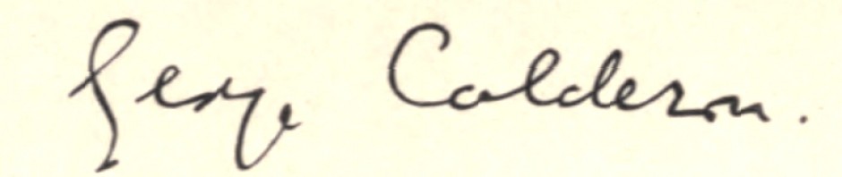
Comment Image

Posted in Personal commentary | Tagged , , , , , , , , , , , , , , , , , , , , , , , , , , , , , , , , , , , , , , , , | 5 Comments

Does computer typesetting produce a ‘chaotic system’?

Morpho Butterfly by Asturnut

Morpho butterfly in a rainforest…
(taken by Wikipedia user Asturnut)

Like me, I expect you have wondered why a modern commercially published book that is to all appearances superbly produced can neverthless have typographical garbage and weird other phenomena in it, or why odd entries in its Index are consistently a page out.

One of the forms of garbage that has always intrigued me most is foreign fonts — letters with accents or diacritics etc — that MUST have been correct in the final proof seen by the author, but have neverthless come out in the printing as percentage signs or something. How could this and other weirdnesses be the fault of the author, I reasoned to myself; they must have crept in at the printing stage. Yet this does not make much sense either, since what the printer receives from the typesetter is a PDF file corrected by the author and typesetter, and how could the printer’s software alter a PDF file? (In fairness, two computer-literate people have suggested to me that it can.)

Well, as a result of Sam1 and Sam2’s experience of seeing George Calderon: Edwardian Genius through the press, I think I can say that we have got to the bottom of it. The phenomenon is the fault neither of the author nor the printer. It is the fault of the complexity of modern computer typesetting software itself.

Take the following example. From the first typescript input by the author in Libre Office in about 2013 through three sets of proofs up to and including the fourth, which was in PDF, two book titles in chapter 8 of my book have always been italicised. But, for goodness’ sake, in the published book they are in roman! How? Why? A quick check with the hard copy proof 4 shows that they were still in italics then, and that was the form in which the text was submitted to the printers…

Except that, unbeknown to us, it wasn’t. When we received the final, fifth, proof from the printers, we were checking for typos, changes in exotic fonts, and in particular top and bottom justification of the spreads of pages (this was because we had noticed in another book printed by Clays, Ruth Scurr’s John Aubrey: My Own Life, that the bottoms of the printed text on right and left pages were rarely level). Two days was not enough to proofread the whole thing word by word, and we certainly did not think that, for example, italics that had been there for five years could have been dropped between proof 4 and proof 5. But they had been dropped in that interval.

Months before, we had noticed whilst we were editing the typeset version that strange effects could appear from nowhere, for example sudden single-line spacing, or a break in right justification preceding an image (see, unfortunately, the last line on page 334). These phenomena seemed random and incomprehensible, but at least they stood out on the page. They were easy to spot. It did not occur to me, at least, that other, less conspicuous phenomena were popping up at random elsewhere.

At this point, it is worth realising that ‘random and incomprehensible’ phenomena have always occurred in printing. Here, for example, is George complaining to the publisher Grant Richards in 1912 that the word ‘name’ at one point in his Two Plays by Anton Tchekhof has been printed as ‘game’, despite the fact that it was accurately printed as ‘name’ in the final proof sent to Richards:

On referring to my proofs I find that it was correctly printed in everything that passed me, and only when it had gone forth with the final blessing, ‘bon à tirer’, did some freakish Puckish mischievous intelligence play this absurd prank with my text, and make Tchekhof talk nonsense.

For heaven’s sake tell me by what rites this impish spirit is to be propitiated in future, or by what prophylactic charms disarmed, tell me where the creature resides, that I may avoid his habitation. One hardly feels safe, if such things can occur, perhaps even under your very nose. I dare not read the rest of the book lest I find more instances of such sacriligious sabotage.

Of course, there was a reason for the wrong character in George’s case, whether it was an anarchic compositor getting his fix or the force of gravity causing the right character to drop out, but still the problem was genuinely random. I fail to see, however, that a change that one hasn’t noticed in a computer typeset text can be random. It seems to me that the text is a deterministic digital system of such complexity that it meets the chaos theory requirement of being ‘highly sensitive to initial conditions’. You flutter your space bar on one page and it produces a cyclone of reformatting on another one without you knowing.

In fact, on page 237 of proof 4 we had to move up the inset quotation with which it starts, because another glitch earlier on had dropped the top of the text too far beneath the running head (PERFORMING FOR THE TLS)… Although there is nothing that I would describe as a logical connection between doing this and losing the italics from book titles in the next paragraph, Sam2 assures me that there is a computer reason, a causal link in a chain reaction. The italics were automatically lost when we moved the inset quotation up, but we didn’t notice that. One can easily see, then, how the bottom line of an indexed page could jump to the next page unobserved.

Problem Page from Book

…and glitches on the printed page

But it is my very great pleasure to hand over now to Sam2 to discuss features of our experience of typesetting the book, in two guest posts. Being a typesetter, computer programmer and mathematician, he knows what he is talking about in this subject-area!

Comment Image

Posted in Edwardian literature, Modern parallels, Personal commentary | Tagged , , , , , , , , , , , , , , , , , , , , , , , , | Leave a comment

The tome weighs in

Here is what I believe to be the first side view of the newly printed biography:

The Tome Weighs In

Weighing in at 2 lbs 2 oz (544 pages)

This is the heaviest book in every sense that I shall ever write…

Pre-publication orders continue to flow in from loyal followers of this blog, for which RENEWED PROFOUND THANKS!

Just a reminder: copies at nearly 10% discount can be bought before 7 September by contacting me direct through mail@patrickmiles.co.uk

If you wish to buy more than one copy, for example as future Christmas presents, naturally you can until 6 September inclusive at the discounted price of £30 including postage.

Another thing I should have mentioned is that I am very happy to sign these copies or write in them whatever you would like for you or their recipients.

We shall finish sending out all advance copies by 13 July, then we shall concentrate on the ‘launch’ — if the publishers can afford one!

Comment Image

Posted in Personal commentary | Tagged , , , , , , , , , , , , , | 2 Comments

Interlude on a familiar theme

Blood Swepts Lands and Seas of Red

‘Blood Swept Lands and Seas of Red’, © Derek Clarke

Clays have pleasantly surprised me by discovering that they have over-printed by not 20 copies, which is the number under/over contractually allowed, but 59 — which they offer me at an extraordinarily good price including free delivery. I have snapped them up. This will enable us to send out more review copies than we had planned. The gnomes of Sam&Sam’s distribution department will therefore work overtime to get these off, with covering letters, before 7 July, the two-month mark before publication…

Meanwhile, Richard Morrison has delivered a Big Bertha salvo about WW1 commemoration in The Times of 22 June 2018 (2 Arts, p. 6) which I feel I simply cannot ignore. It is entitled ‘This national war tribute has descended into overpriced poppycock’. Given that I am supposed to be taking part in presentations about the commemoration around Armistice Day this year, I would be intensely interested to hear what followers of Calderonia think of Morrison’s claims. Unfortunately, the piece is currently available online only behind a pay wall, so I shall have to summarise it.

‘Now that we are approaching the end of 14-18 NOW, the government’s £50 million centenary commemoration of that catastrophic event’, Morrison begins, ‘the same question that was asked in 1918 must be asked again, albeit in a less tragic context. What was the point of it all?’

I won’t mince words. So far, 14-18 NOW has been a colossal waste of money, a bandwagon to which have been hitched some inconsequential arts projects with, at best, a tangential connection to the First World War. And apart from ‘Blood Swept Lands and Seas of Red’, the installation of 888,246 ceramic poppies that attracted millions of people (and wasn’t originally part of 14-18 NOW anyway), it has had minimal impact on the public.

I was instantly reminded of a similar piece by Morrison in The Times of 22 January 2016 in which he fulminated about the fact that the creators of Blood Swept Lands, Paul Cummins and Tom Piper, were ‘even refused an Arts Council grant and [Cummins] had to sell his house in Derby to develop the project’. As I shall elaborate in a moment, the fact that this powerful and inspired installation had no official funding does not surprise me one jot. But ought not Morrison at least to recognise the creative opportunism of the Arts Council in taking it up and bringing it to a far bigger audience? Was this not a good thing? Similarly, I personally found it hilarious that the 14-18 NOW website co-opted the unveiling of Millicent Fawcett’s superb statue in Parliament Square as though they, 14-18 NOW, had been somehow involved in campaigning for and funding it, but even so I applaud their opportunism in recognising the significance of the moment. Surely one should be grateful to them for contextualising women’s suffrage in the War?

According to Morrison there are two reasons for the ‘minimal impact’ that 14-18 NOW has supposedly had on people:

First, with no veterans left, the personal connection to the First World War has been lost. Of course there’s nobody alive who can remember women getting the vote either, but that centenary has resonated much more widely because the issues that galvanised the suffragettes are still hot topics.

Even if First World War veterans were still around, though, I doubt whether 14-18 NOW would have made much impression. Not with our politicians so fixated on Brexit. The mood is all wrong. How can we lament the conflict that tore apart Europe a century ago when we are obsessed with how to tear apart Europe now? [There follow ten lines of similar impassioned questions comparing aspects of WW1 with Brexit.]

It seems to me that this overlooks two fundamental things. First, ‘personal connection’ does not depend on people still being alive who lived through a catastrophic event. Personal connection is experienced by those left behind who emotionally connect with the dead and grieve for them. Feeling and thinking like this is what ordinary people do. You only have to have followed Twitter or read local newspapers in the last four years to know that it’s what millions of families in Britain have been doing. Almost every week I hear about projects in villages up and down the country that ‘personally connect’ with those who did not come back to their villages or town streets. The epitome of such personal connection is Andrew Tatham’s history and art project A Group Photograph: Before, Now & In-between, which was also awarded no Arts Council funding and has received precious little official recognition, e.g. from 14-18 NOW, either.

Second, the shenanigans of Brexit negotiations cannot, in my opinion, influence people’s emotions and thinking about the commemoration, rather the reverse: the electorate’s mood about the First World War may have influenced Brexit. Why people grieve and shed tears for soldiers they never knew is that they feel these soldiers’ lives were nihilistically wasted in a war that should not have happened and that we should not have had to fight. They feel that men and women of their families had to go and die because we had to help save Europe from itself. We had to fight and win the war because of our tragic geopolitical position, namely that we are with Europe but not of it. Whether we realise it or not, commemorating the national holocaust of 1914-18 has reminded us every day of our tenuous historical relation to Europe. It has held constantly before us our apartness and the dangers of involvement. The issues of the First World War are therefore white-hot topics. Subliminally, could that have made the difference of 4%?

The remaining three-fifths of Morrison’s article are devoted to taking apart the latest 14-18 NOW event Fly by Night, as well as Rachel Whiteread’s ‘inside-out Nissen hut’ in Dalby Forest, the forthcoming Shrouds of the Somme installation (‘just a remake of Blood Swept Lands and Seas of Red, only with ghoulishness replacing tragic beauty’), and Danny Boyle’s event advertised for 11 November ‘inviting communities across the UK to come together in marking 100 years since the Armistice’. Morrison has been

surprised by how spurious many arts projects promoted by 14-18 NOW are. It’s possible that, in the 150-odd days remaining until November 11 we will be struck speechless by some extraordinary statement, but I’m not hopeful.

This too is wrong-headed. Like it or not, 14-18 NOW is a species of official art. Official art is enacted to recognise, and not much more, what a nation is feeling or in the opinion of the establishment should feel. It is very rarely great art, can be good art, but is usually kitsch and tat. Are Nelson’s Column, the Gold State Coach, or William Orpen’s vast canvas The Treaty of Versailles, 1919, great art? Although we know that Edwin Lutyens’ aesthetic decisions for the design of the Cenotaph were extremely fine, you could still not call the Cenotaph great art. It is disingenuous of Morrison, therefore, to expect ‘extraordinary artistic statements’ from those artists commissioned by 14-18 NOW.

Partly that is because they are doing it for money. It may sound laughably romantic, but I do not think extraordinary artistic statements can be conjured up for money; rather, they are produced by individuals who viscerally HAVE to create them, whether they are paid for it or not. But if they would not create official art for normal inspirational reasons, they have to be more or less, er…well…bribed to do it! That’s one reason why official art has never come cheap. Given the scale of some of 14-18 NOW’s events, the length of time it covers, and the number of administrators it has to employ, I actually don’t think £50 million is off the scale for official art of this national importance.

Moreover, it is taxpayers’ money spent on taxpayers. As far as I know, there have not been howls of protest at what the taxpayer is getting for £50 million. True, there have not been tidal waves of approval and gratitude, either. But that is exactly how it is with official art: if it is fine, if it more or less works for people, then it is accepted and no-one says anything. The original Blood Swept Lands and Seas of Red at the Tower of London had five million visitors in four months and even a full-page image and commentary in the German newspaper Die Zeit. I am reliably informed that it was 14-18 NOW’s idea to turn off one’s house lights on the evening of 4 August 2014 and place a lighted candle in one’s window. This was observed by millions, too. It utterly caught the national mood: despair clinging to hope. Similarly, Dr Kenneth Bogle, writing in The Times on 25 June, was affected ‘among many evocative [14-18 NOW] artworks’ by Jeremy Deller’s We Are Here:

On July 1, 2016, the centenary of the first day of the Somme offensive, volunteers dressed as First World War soldiers appeared in public spaces across the UK, such as high streets and railway stations. Each carried a card with the name of the soldier they represented, his age and when he died.

Commuters and passers-by were mesmerised by these ghost soldiers. This imaginative project, which lasted only a day, was a reminder that the Great War casualties were living, breathing human beings, often pitifully young. Their war did not take place in black and white.

Clips of this ‘modern memorial’ are available online and never fail to move me to tears.

There we have it. Two things strike me: the actors were volunteers and the writer’s personal connection with the 14-18 NOW event moved him to tears. From the general lack of grumbling and from the conversations I have had about the subject, I think people feel that the 14-18 NOW commemoration is fitting and proper. In a strange way, I think families are touched that their government has put its money where the people’s heart is. For official art, 14-18 NOW’s success rate has been well above average. It has enabled us to share, in Wilfred Owen’s words, ‘The eternal reciprocity of tears’.

Comment Image

Posted in Edwardian character, Heroism and Adventure, Modern parallels, Personal commentary | Tagged , , , , , , , , , , , , , , , , , , , , , , , , , , , , , , , | 5 Comments

Thank you!

We are two-thirds of our way through sending out advance, review and complimentary copies all over the world, and have received many plaudits for the appearance and even ‘beauty’ of the book, as well as overwhelming approval of the in-text images. Thank you all no end, and also for the numerous literary comments early readers have made! Obviously, I will marshal both positive and critical responses in a future post.

Meanwhile, I am also fantastically grateful to those followers who within a fortnight have bought 31 copies of the book at the pre-publication price of £30 including postage. This suggests we will meet our target for such sales before the official publication date of 7 September. Until 6 September you will still be able to buy copies at the reduced price from me direct, but after that sales will be managed through http://samandsam.co.uk/.

Back to packing…

Comment Image

Posted in Personal commentary | Tagged , , , , , , , , , | Leave a comment